Arena
Naming / Brand Identity / Art Direction / Collateral
The client approached us with a vision to launch a high-end concierge service with focus on startup that required a visual foundation rooted in sophistication and timelessness. The objective was to move away from the loud, saturated trends of the current market and instead develop a brand identity that emphasizes a high end aesthetic, intentionality, and simplicity.
The Strategy: "Honest" Minimalism
To achieve a sense of "quiet luxury," we focused on the concept of restraint. Every element, from the slight curve in the A of the logotype to the texture of the brand’s physical assets was designed to feel curated rather than manufactured.
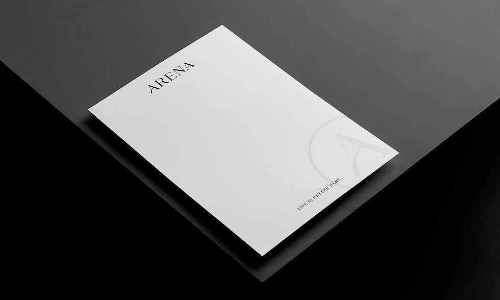
The Creative Execution
-
Logotype Design: We developed a custom, minimalist logotype using clean lines and balanced proportions. The typography was treated with subtle, phonetics to ensure the brand name feels as elegant as it looks.
-
Visual Identity: A palette of black, charcoal, silver and warm grey was selected to evoke a sense of calm and exclusivity. This was paired with a grid-based layout system that allows for ample white space, giving the brand room to breathe.
-
Art Direction: We provided comprehensive creative direction for the brand's launch imagery. Utilizing a cinematic lens, the photography focuses on tactile details, natural light, and "honest" materials, capturing the brand’s lifestyle in its most authentic form.
The Result
The final identity successfully positions the startup as a a unique offering in luxury bespoke entertainment venues. By prioritizing subtle elegance over flash, the brand now possesses a versatile visual language that scales effortlessly across digital platforms and physical environments, resonating deeply with a discerning, ultra-high-net-worth audience.